Contrast, Repetition, Alignment, and Proximity
Within this site, I examine four other handpicked sites to see which of
the four essential web design
principles they each align with best.
Contrast
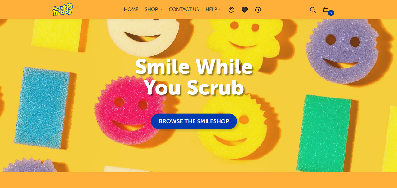
Scrub Daddy
- Though more apparent as one scrolls through,
the Scrub Daddy site is a good example of contrast.
- The difference between the bright orange and deep blue,
paired with white highlights,
creates quite the striking visual for the viewer.
- The array of sponges presented upon the first click only serve
to aid in the strong juxtaposition.
Repetition
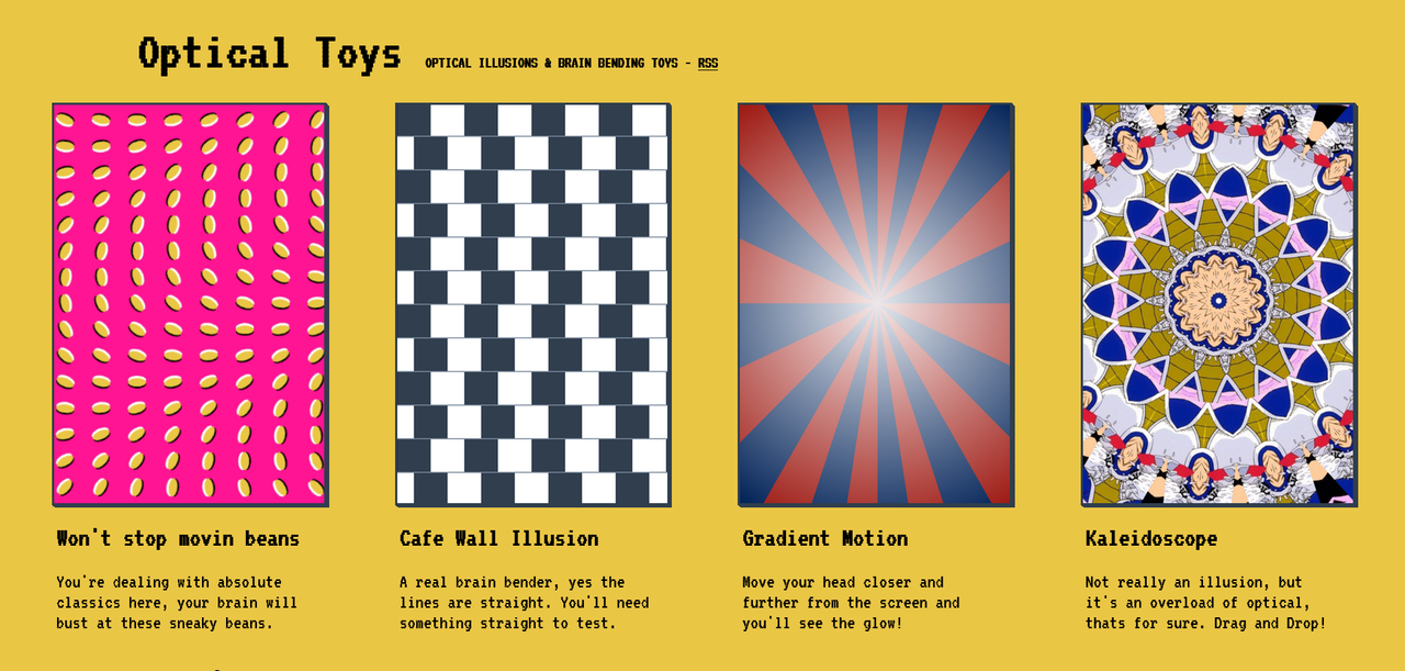
Optical Toys
- This website acts as a display for common optical illusions,
laid out simply in an easy-to-navigate manner.
- There is a consistent flow as one scrolls through and experiences these oddities,
a clear pattern that manifests unity via the simple presentation of the interface.
- The text's font, its color, size, and the background color all stay consistent,
repetitive and reliable,
even as the viewer continues to discover even stranger brain twisters.
Alignment
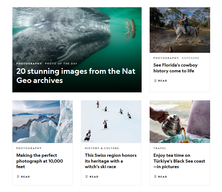
National Geographic
- Why Specifically The Photography Section?
- Most of the art to photography is in the alignment of the photographer's shots,
and how cleanly
they choose to present them. Being extremely cognizant of spacing and
alignment is their whole thing.
- Organization Is Key!
- The grid structure of the site organizes the site's many photo collections nicely,
as photographers
and their viewers frequently groove with arrangements that are
aesthetically pleasing.
- But... Why The Whales And Cowboys?
- Believe it or not, neither the whale nor the cowboy are central to the point.
Proximity
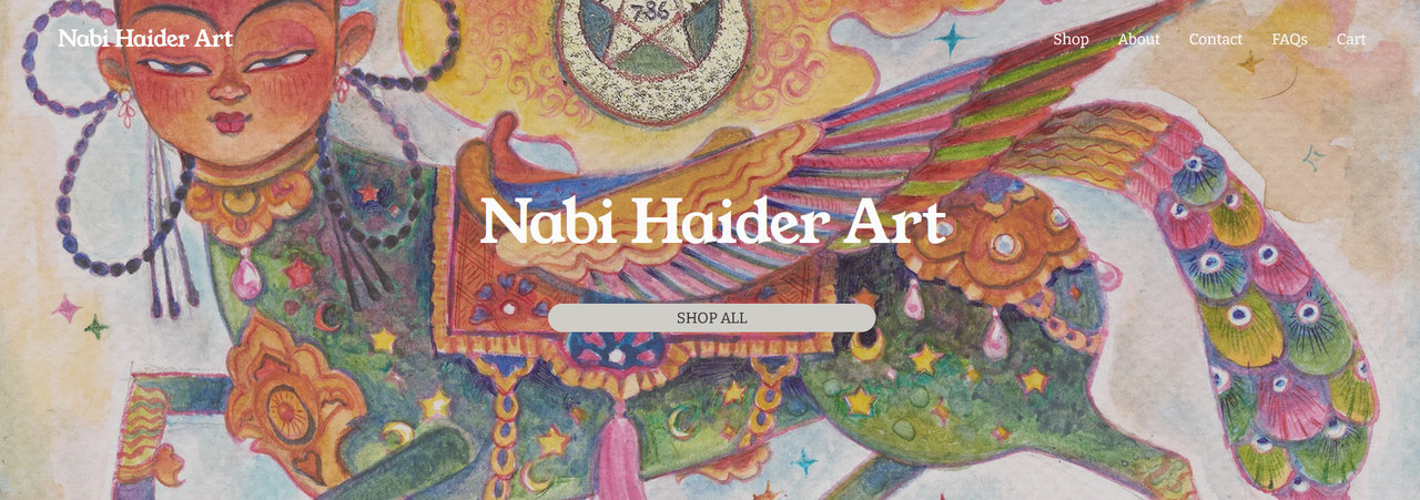
Nabi Haider Art
- Why His Shop Page?
- The art piece's close proximity to the top catches the eye effectively,
guiding the viewer's attention
towards the "shop all" button almost immediately.
Very to-the-point.
- It's Straightforward!
- The site is simple, serving its purpose efficiently. Never straying from the main idea,
while still being quite interesting to look at because of the art.
- Keeps Conflicting Elements Apart!
- It's well-structured. Prioritizing being a portal to selling art,
then, as the viewer scrolls, displaying any
urgent information about its sales,
before allocating space for a method of contact, if needed.
Very succinct.
In Conclusion...
I've realized while scrutinizing these websites that a lot of web design and
its principles are quite similar to
many commonly understood art principles.
In fact, I don't think it's much of a stretch at all to say that to hone
the skill of making good websites, one must have studied or at least have a good
sense of the core principles of
art design, because a well-rounded website
commonly incorporates them all. Knowledge of them is necessary
if one wishes to stand any sort of chance at making sites that don't look
absolutely butt-ugly.